Print 101
At SKPrints we have print specifications that must be followed when setting up your artwork to be printed. This is to ensure that the files come out correctly and meet you high expectations. We have created a basic guide to help you understand print design and learn more about proper file preparation and print production.
Set UP Files in CMYK NOT RGB
When setting up your artwork files, it is important to use the correct color space for the intended media. Artwork designed for digital consumption will always be using the RGB colour space because computers, laptops, tablets and smartphone screens are designed to use the RGB color space. When it comes to printed media, the correct color space to use is CMYK. By designing in this mode, you will have a better idea of what the colors are going to look once it is printed.
CMYK or Process Colour is the basis for printed media and using small dots of Cyan, Magenta, Yellow and Black an image can be produced. Black is denoted by the letter "K" as it refers to the Key Plate. This plate provides definition and detail to an image using a greyscale as human eyes are particularly sensitive to greys.
So what is the difference between CMYK and RGB?
Additive Colour
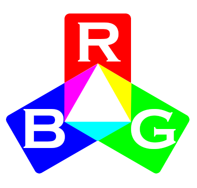
Additive colour refers to the mixing of visible light emitted from differently coloured light sources; in this case Red, Green and Blue. When these three primary colour are combined the result of this addition is White and when all three are absent (meaning the lights are off) then we have Black. This is the basis for all modern screen technology and it is why when specifying for Digital Media the RGB colour space is used.
Subtractive Colour
In a subtractive colour model, colour is the result of the absorption and reflection of light from a surface by different materials coloured naturally or by the use of paints, dyes and inks. In this case the light source is White and as it reflects off different surfaces certain wavelengths from the light spectrum are absorbed by the material (the subtractive part) which results in different wavelengths (colours) of light being observed.
Colour Separation
Printed Media is based on subtractive colour, therefore it is very important that artwork is setup using CMYK. When the print files are sent to us it will be separated into these 4 process colors.
During this separation, screen tints comprised of small dots are applied at different angles to each of the four colors. The screened separations are then transferred to four different printing plates, one for each color, and run on a printing press with one color overprinting the next. The composite image with all the small dots fools the naked eye with the illusion of continuous tone.
Spot Colours
Spot or Solid Colours are colours created without screens and dots. The most widely used and accepted is the PANTONE MATCHING SYSTEM®. Most spot colours are created from a palette of 18 basic colours. Each spot colour is mixed according to its own ink mixing formula from the 18 basic mixing colours. Each PMS colour has a unique number followed by either a C or U. The letter suffix refers to the paper stock on which it is printed: C for Coated paper and U for Uncoated paper.
Using Pantone numbers is the defacto method of defining a spot colour, however it is not the only way to do it. The most accurate way of defining a colour is to provide a CIELAB value or simply Lab values. It expresses colour as three numerical values, L* for the lightness and a* and b* for the green–red and blue–yellow colour components as an absolute value. CIELAB was designed to be perceptually uniform with respect to human colour vision, meaning that the same amount of numerical change in these values corresponds to about the same amount of visually perceived change. Lab values are also device independent; meaning that it is the best way to communicate different colours across different devices. Any object’s colour can be measured and defined as a LAB colour with the use of a spectrophotometer. If you send us a swatch we are able to measure and match it.


